These guidelines are designed to advise higher education institutions on when and how to use the logo for the Research Excellence Framework 2028.
Background to the REF
The Research Excellence Framework (REF) is the system for assessing the quality of research in UK universities and higher education colleges. The REF was first conducted in 2014, and replaced the Research Assessment Exercise (RAE). The previous REF exercise concluded in 2021. It is jointly run by the UK’s four higher education funding bodies:
- Research England
- Medr, Wales’ Commission for Tertiary Education and Research
- Scottish Funding Council (SFC)
- Department for the Economy in Northern Ireland
The team managing the REF on behalf of these bodies is located in Research England.
Since mid 2022, preparations have been under way for the next assessment phase, REF 2029.
The REF logo: when to use it
REF 2029 has an authorised logo which higher education institutions (HEIs) are encouraged to use in appropriate circumstances.
These appropriate uses are, for example on:
- HEIs’ external-facing websites on pages where their participation in the REF, or their REF results, are being discussed.
- web stories or news items that HEIs may publish calling for nominations for people to serve on REF panels.
- HEIs’ intranets where the processes for participating in the REF, or REF results, are covered.
In general, HEIs should only use the REF logo on specific REF-related communications with an identifiable purpose, and not on general routine communications. For example, an HEI would not use the REF logo on its home page where it might look like an endorsement or partnership branding for the institution.
We do not endorse the use of the REF 2029 logo on email signatures, business cards or name badges of staff in HEIs who are working on REF submissions or acting as REF project managers within HEIs. It is important to avoid implying that HEI staff are part of the team which manages the REF on behalf of the four funding bodies.
To avoid confusion about the origin and ‘ownership’ of materials, the REF logo must not be displayed as the primary or most prominent feature on any material produced by HEIs. Such materials should be clearly identified as produced by the originating institution and branded accordingly. The REF 2029 logo should not be used in a way that implies endorsement by the REF team of an HEIs content.
The logo should not be used in any way that contributes to disparaging the REF exercise, undermining its brand identity, or undermining the reputation of any of the four bodies that sponsor the REF (see Background to the REF, above).
HEIs must only use the REF logo for the applications for which it was requested and supplied.
If used alongside or in a group of other logos, the REF 2029 logo must still be displayed in accordance with the minimum size and exclusion zone details described below.
Colours and formats
The REF logo is available in three colour versions:
Purple and blue – this is the default version with a white background, for general use on a white background:
White only – for use on a dark background:
The REF logo is also available in black and white as shown below:

Applying the REF logo
Exclusion zone
In order to maintain the impact of the logo and avoid ‘crowding’ it, please ensure there is a space around it on all sides that is clear of any graphics or type.
The minimum clear space area that should be left around it is defined by the width of the capital R in REF, as shown below.

Minimum size
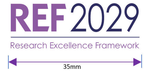
We have defined the minimum size at which the logo can be used. This minimum size is 35mm wide for print applications and 100 pixels wide for digital applications.
Alteration and manipulation
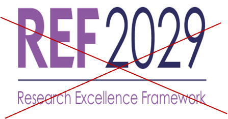
The logo should be used only as supplied. Effects should not be added and colours should not be changed. No additional type should be added to the logo and existing type should not be moved or edited.
Please do not alter the makeup of the logo, shrink or expand it in such a way that its proportions are distorted. For example the following types of stretching or compressing should be avoided:

Contrast and background
We advise good contrast between the logo and its background. If the logo is placed on a dark background we suggest using the white option. If placed over images, the logo should only be placed on images where there is strong contrast between the background and the logo and where the logo clearly stands out. The logo should not be used over an area of detail within an image.
Other branding considerations
The font type used in the REF 2029 logo – which is an adapted version of ITC Kabel with the words ‘Research Excellence Framework’ in Century Gothic – should not be used elsewhere in materials which HEIs produce about the REF, whether in headings or body copy. These fonts should be reserved for the REF logo.
Apart from the logo variants described in this guide, there are no stock images or other graphic designs supplied for HEIs to use when producing materials relating to the REF.
Logo file requests and questions
To request logo files, and if you have any queries about REF 2029 logos or branding which are not covered by this guide, please contact info@ref.ac.uk.